With SMLXL Rem Koolhaas redefined the architectural monograph. Now with Content he has done it again. In the wake of SMLXL several architects published equally bulky books, - I'm thinking of Farmax by MVRDV and Move by Ben van Berkel and Caroline Bos/UN Studio -, but none could even begin to rival the impact of SMLXL when it was first published.*
SMLXL was conceived in collaboration with the Canadian graphic designer Bruce Mau, who was credited on the cover alongside Rem Koolhaas and OMA and who subsequently went on to publish some equally voluminous books of his own. For Content Koolhaas has collaborated with British design team Simon Brown and Jon Link of &&&.
Whereas SMLXL is a massive book, Content, with its soft cover and cheap paper, aims to be a cross between a book and a magazine. As a cartoon building says on page 12 "I'm not sure if this is a book or a magazine" to which another cartoon building responds "Actually, I find the tension between the two super-interesting." It features advertisements, short essays by invited authors and a number of interviews, all of which underscore the magazine aesthetic. But with many fashion magazines getting thicker and thicker, Content's 544 pages are actually relatively modest. A recent issue of American Vogue, "our thickest issue ever", had 675 or so pages.
One of the interviews is with Martha Stewart and I can imagine some heated debate at AMO|OMA as to whether to include it or not. The interview is dated 20 January 2003. At that time an inquiry into Stewart's alleged insider trading was already on its way. Says one of the interviewers: "I think you’re a role model for modern women – extremely successful, busy and ever-expanding."
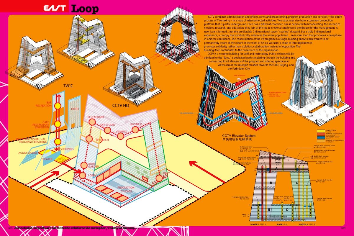
Content and SMLXL have much in common. Both are a real treat if you enjoy an eclectic mix of text and images. Paintings by Vermeer are paired with stills from Big Brother and there's a lot of cut and paste layering of images. One of the most notable differences is that in Content, with the exception of a two-page layout of the CCTV Tower in Beijing, architectural drawings have been left out altogether. I think this is significant. Architectural drawings are only of interest to architects. Anyone else only sees a dense pattern of black lines and some unreadable numbers. By leaving them out OMA|Rem Koolhaas make a clear statement about the direction the architectural monograph is heading into and the audience it aims at. Call it emancipation. If you’re interested in the drawings I’m pretty sure you can find them in the next OMA|Rem Koolhaas issue of El Croquis. [Update: El Croquis 134/135]
On a critical note, some of the texts in Content work a bit like the lyrics of many pop songs: they look good on the page, but don't read them for their "content". I still find the essays in SMLXL interesting and relevant to this day. They reveal fascinating insights into architecture and urbanism. The problem with Content is that much of what it says, was already present in SMLXL and that, insofar as it tries to broaden its scope, the further it gets away from its core of architecture and urbanism, the shallower it becomes.
In the introduction Rem Koolhaas writes that "Liberated from the obligation to construct, it [architecture] can become a way of thinking about anything – a discipline that represents relationships, proportions, connections, effects, the diagram of everything." Browsing through Content it is difficult to avoid the impression that this whole idea of "architecture as a way of thinking" comes down to some people playing around with Photoshop and having a good time cranking out wild ideas without bothering much about thinking through the consequences and pre-conditions. For all its talk of "the ceaseless fluctuations of the early 21st century" and "embracing instability as a new source of freedom" it is also surprisingly similar to early 20th century modernism. I'm not sure whether that was intended. And as to Going East, which it names as its dominant theme, didn't Le Corbusier already move East?
The Seattle Public Library, the Dutch Embassy in Berlin and the CCTV Tower show that, despite all the talk, Rem Koolhaas is still first and foremost an architect with a very distinct signature who designs some amazing buildings. If you're interested in lush images of those buildings and their respective models and drawings you will have to wait until the next OMA|Rem Koolhaas issue of El Croquis or until I've been to Seattle or Porto (update: I've been to Porto!). Content is a record of the thinking that informs those designs. At EUR 9.99 (GBP 6.99) it is a real bargain for a publication seething with ideas and creativity.
(*) Incidentally, you can tell the print from the colour of the letters SMLXL on the book's rug: yellow is the first print, orange the second print and I think that blue is the third print.
Links
My review of Content: The exhibition.